A strong brand identity tells a story, resonates with audiences, and drives loyalty. A crucial part of building this identity lies in graphic design. The visual elements of a brand, from the logo to the typography to the colour palette, they are the foundation of what creates immediate recognition and establish emotional connections. In the world of branding, graphic design is not just a tool—it is the language that speaks for a brand.
When someone encounters a brand, whether on a website, social media post, or product packaging, they make judgments within seconds. These first impressions often come from visual cues, not words. Graphic design is the vehicle that shapes these impressions and reinforces the message a brand wants to communicate. With the right design, a brand can convey professionalism, innovation, warmth, or any other quality essential to its identity. When done well, graphic design creates an immediate sense of familiarity, inviting people to engage.
Consistency is a fundamental part of effective branding. A brand that uses consistent colours, fonts, and imagery across platforms fosters trust. This consistency is where graphic design becomes especially important. Every visual element, from website banners to printed flyers, should reinforce the brand’s identity in a unified way. When brands fail to maintain this consistency, they risk losing credibility and recognition. This kind of unity in design makes a brand more memorable. Familiarity leads to trust, and trust leads to customer loyalty. Over time, consistent branding creates associations in people’s minds. A customer doesn’t just remember the name of the brand—they remember how it makes them feel, and much of that feeling is tied to the brand’s visual elements.
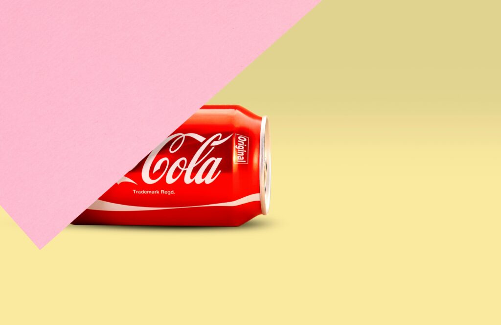
Colour is one of the most powerful tools in graphic design. It triggers emotional responses and can influence people’s perceptions without them realizing it. Different colours evoke different feelings and associations. Red might suggest energy and passion, while blue could represent calm and professionalism. Successful brands know which colours align with their core message and use them to enhance their identity. When used strategically, colour becomes a part of a brand’s language. Coca-Cola, for instance, is inseparable from its signature red, similarly, Tiffany’s blue is recognized globally. These brands own their colours because they’ve used them consistently, embedding them in people’s minds. Without consistent use of these colours, the emotional response would not be as strong.
Typography, or the style of font a brand chooses, also shapes its identity. Just as with colour, typography conveys tone and personality. A brand that wants to appear professional and reliable might choose a classic serif font, while a brand that aims to be more modern and bold could opt for a sleek, sans-serif font. Typography choices should align with a brand’s message. The key is to keep this choice consistent across all channels. When a brand frequently changes fonts or mixes too many styles, it sends a confusing message to audiences. In contrast, a clear and consistent typeface becomes part of the brand’s identity, making it easier for people to recognize and trust the brand.
Logos are another central component of graphic design in branding. A logo is often the first thing people notice, so it needs to capture the essence of the brand. It is more than just an image, it is a symbol of everything the brand stands for. Think of Apple’s logo or Nike’s swoosh. Both are instantly recognizable and evoke the values of their respective brands. These logos are simple, memorable, and designed to leave a lasting impression. A well-designed logo gives a brand a competitive edge. It serves as a visual shortcut, a way for people to remember a brand at a glance. Creating this recognition takes time, but consistent design choices across all visual platforms help build this connection.
Graphic design also impacts brand perception by establishing professionalism. High-quality, thoughtful design shows audiences that a brand cares about details and values excellence. When visuals look polished, it reassures customers that the company is trustworthy and reliable. Poor design, on the other hand, can send the opposite message. Misaligned elements, clashing colours, or inconsistent imagery can make a brand appear unprofessional or even careless. Quality design helps a brand make a strong first impression. It creates the sense that a company is reputable and takes itself seriously, inviting customers to do the same. Good design is an investment that pays off by attracting and retaining clients.
In a world where people are constantly exposed to a flood of information, simplicity in graphic design makes a brand stand out. Overly complex designs can overwhelm audiences and make a brand hard to remember. Clear, minimalist designs that communicate the essentials allow people to instantly recognize and connect with the brand. Successful branding focuses on clarity and makes it easy for audiences to understand what the brand represents. Graphic design, when done right, simplifies complex messages. It uses visuals to make brand identity easily understandable and accessible, fostering a deeper connection with audiences.
Graphic design is more than just aesthetics, it is a strategic asset. It strengthens a brand’s identity by making it instantly recognizable and memorable. Consistent use of colours, fonts, and imagery solidifies the brand in people’s minds, creating familiarity and building trust. Over time, people begin to associate these visual elements with the values and promises the brand represents. Through the power of graphic design, a brand becomes more than a product or a service. It becomes an experience, something that customers identify with and feel loyal to. The impact of branding is lasting, and the influence of graphic design on branding is undeniable. By investing in thoughtful, consistent design, brands not only set themselves apart but also build a lasting connection with their audiences.